Several months ago, we embarked on an ambitious three-month project with a global pharmaceutical company to create a corporate style guide for Qlik Sense. While many people try to make their designs presentable in Qlik, nobody claims to be creating anything extraordinary. Tableau has set a high bar for beauty, and everyone seems to have come to terms with it. Therefore, the task was an invitation for us to step out of our comfort zone with Tableau and extract the most from Qlik Sense to create a design that would inspire us and suit our needs.
The project was divided into two parts:
- Formulating unified requirements for report development and their visual design for bi analysts within the company.
- Creating scaling tools in the corporate BI project, including a template, theme, guide, and visual vocabulary.
Procedure
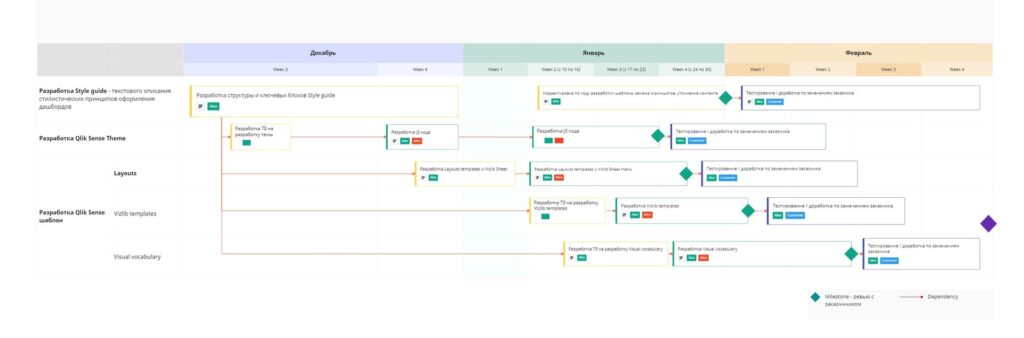
We decided to approach the project flexibly, as we didn’t know the limits of Qlik and VizLib’s ability to customize individual elements. Creating a complex unified header with navigation features, different filter panel variants, and buttons posed a particular challenge. It was also unclear how much formatting could be embedded in a QS JS Theme. Additionally, the project required a lot of stylistic subjectivity, such as palettes and chart design. As a result, we agreed to adopt a flexible approach, breaking the project down into one-week sprints, and making decisions within the working group, rather than following a formal customer-executor paradigm (a highly risky approach, used in certain situations, not suitable for most projects).
We used miro as the project tool for formalizing requirements and collecting results. This tool was not the most obvious choice, but it proved to be perfect for remote collaboration between team members. Furthermore, we had an idea to use miro to design the target document (the guide itself), instead of using slides in PowerPoint. We created a miro-board, dividing it into various spaces for different content types, such as an area for fixing requirements, a planning area, an assembly area for the final result, and an area of reference artifacts.
Development
(Fake data is included in the screenshots, and permission was granted by the customer.)
Step 0
We first looked through the brand books and selected the most adequate material to regulate the design within the company. We also went through various presentable and well-known BI guides.
Step 1
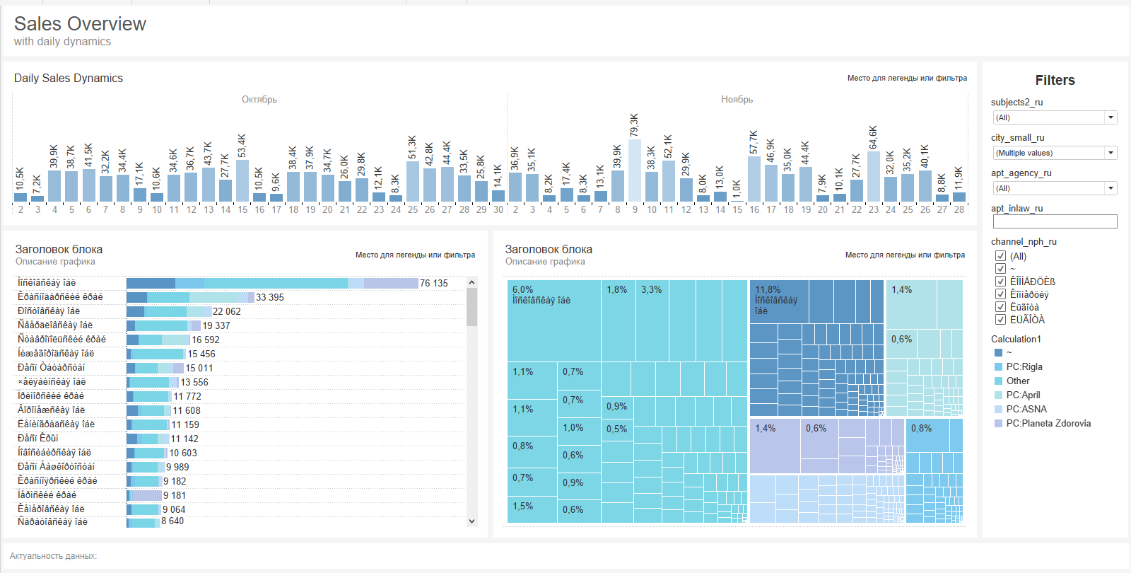
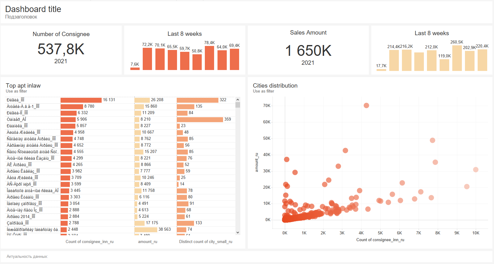
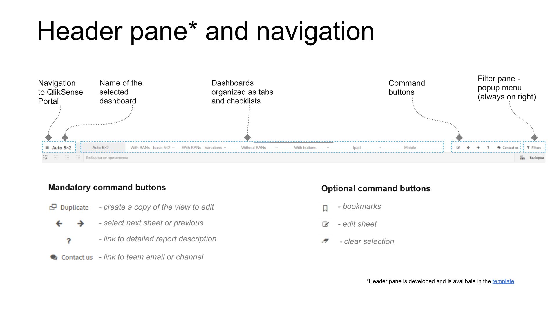
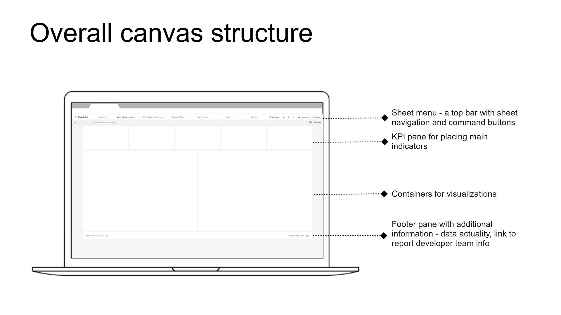
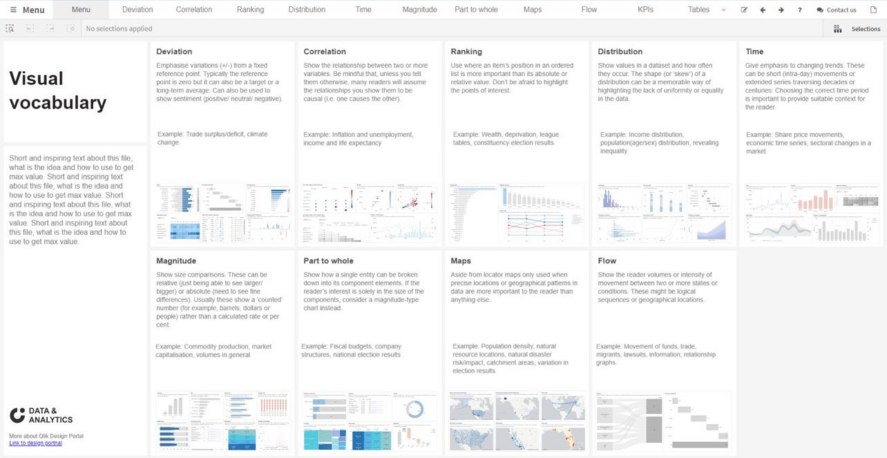
The standardized view of the report was the central element of the BI guide – the way the basic dashboard layout and navigation are perceived. This approach has already been established after many years of working with Tableau. We took the most trendy layout with a gray grid as the basis. However, it was not clear how to employ a sidebar of navigation icons and a filter panel in a click. We planned to extend Vizlib Sheet’s menu in the form of a header.
Step 2
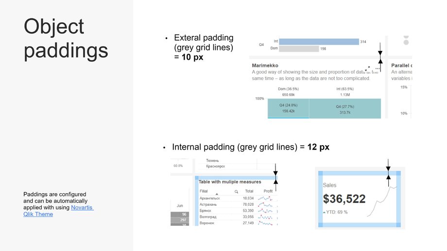
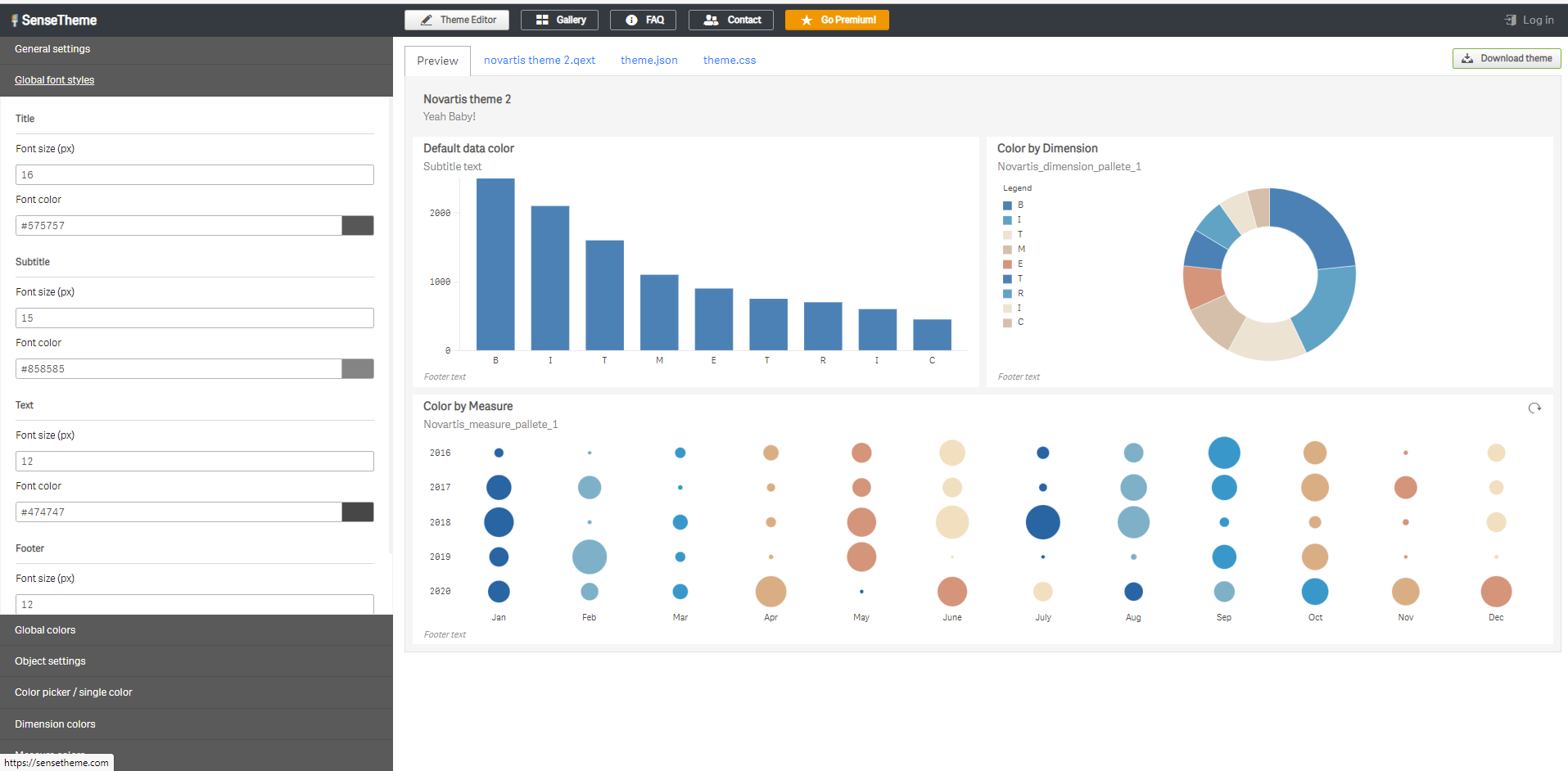
We started with the challenging task of creating a corporate Qlik Sense theme. A custom theme in a click is a collection of files that help to promptly override basic formatting, such as fonts, colors, and padding. The Qlik Sense theme is an excellent feature worth adopting by Tableau. Our goal was to stay within the theme capabilities, so that we wouldn’t have to make CSS adjustments, allowing us to create an easily scalable template. We used simple generator programs on this subject to set our theme (see sensetheme). At this stage, we fixed fonts for different types of text, background colors (light gray), object paddings (which eventually create a gray grid), and removed all sorts of noise and strokes. We also uploaded several test palettes of different types to understand their capabilities. We devoted some time to creating color palettes.
Step 3
Develop a plan of action: Once you have identified the areas of improvement, develop a plan of action to address them. This plan should outline specific steps and strategies that you will use to address each area of improvement. Make sure your plan is SMART (specific, measurable, achievable, relevant, and time-bound) and that it takes into account any potential obstacles or challenges you may face.
For example, if your area of improvement is time management, your plan of action may include strategies such as setting priorities, using a planner or calendar, delegating tasks, and avoiding distractions. You may also set specific goals, such as spending a certain amount of time each day on a particular task or completing a project by a specific deadline.
Remember that your plan of action should be flexible and adaptable. You may need to adjust your strategies as you go along, depending on what works best for you. Also, don’t be too hard on yourself if you don’t see immediate results. Improving yourself takes time and effort, but with perseverance and dedication, you can achieve your goals.
Step 4
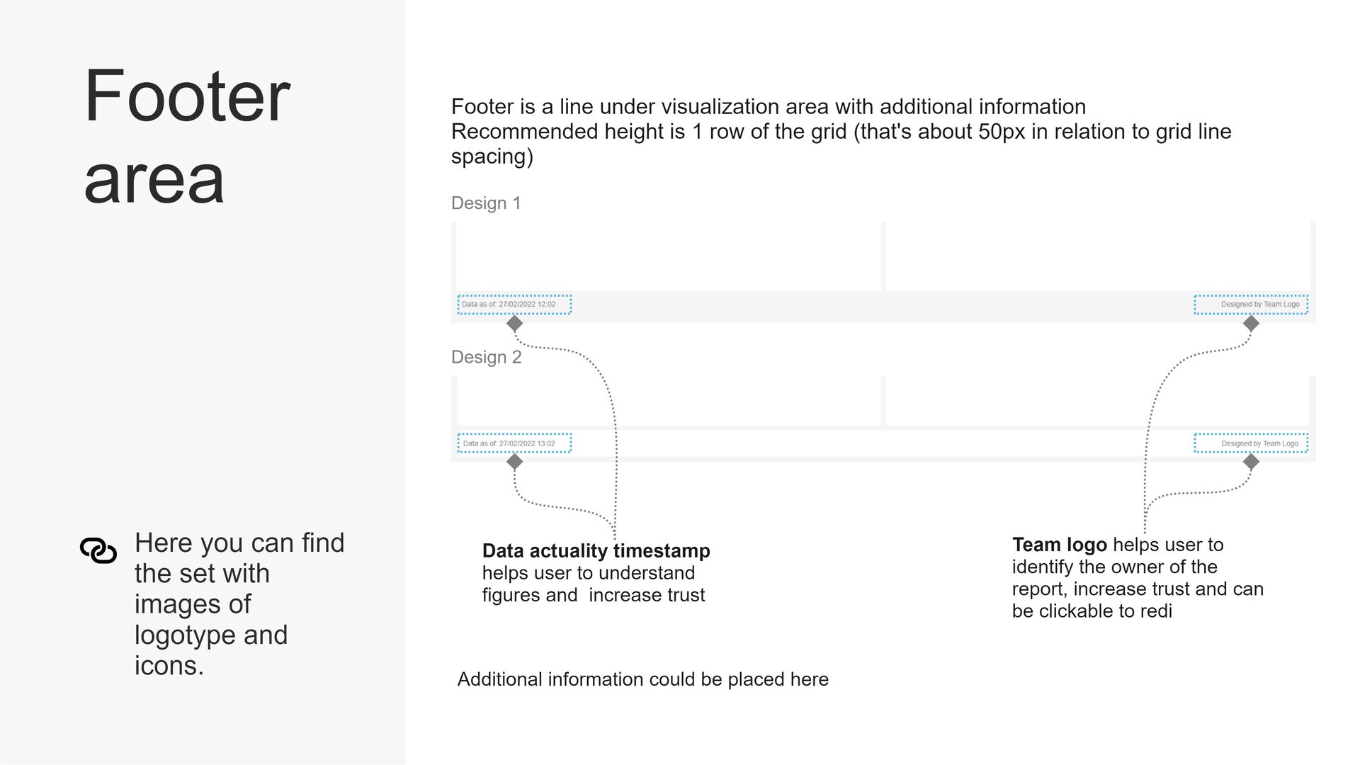
As we progressed with the project, we encountered challenges in designing the filter panel, which is a crucial element in any BI report. We had to create a solution that would not only be functional but also aesthetically pleasing. We experimented with various design options, such as vertical filters, accordion-style filters, and drop-down filters, before finally settling on a horizontal filter panel with icons for quick navigation.
Step 5
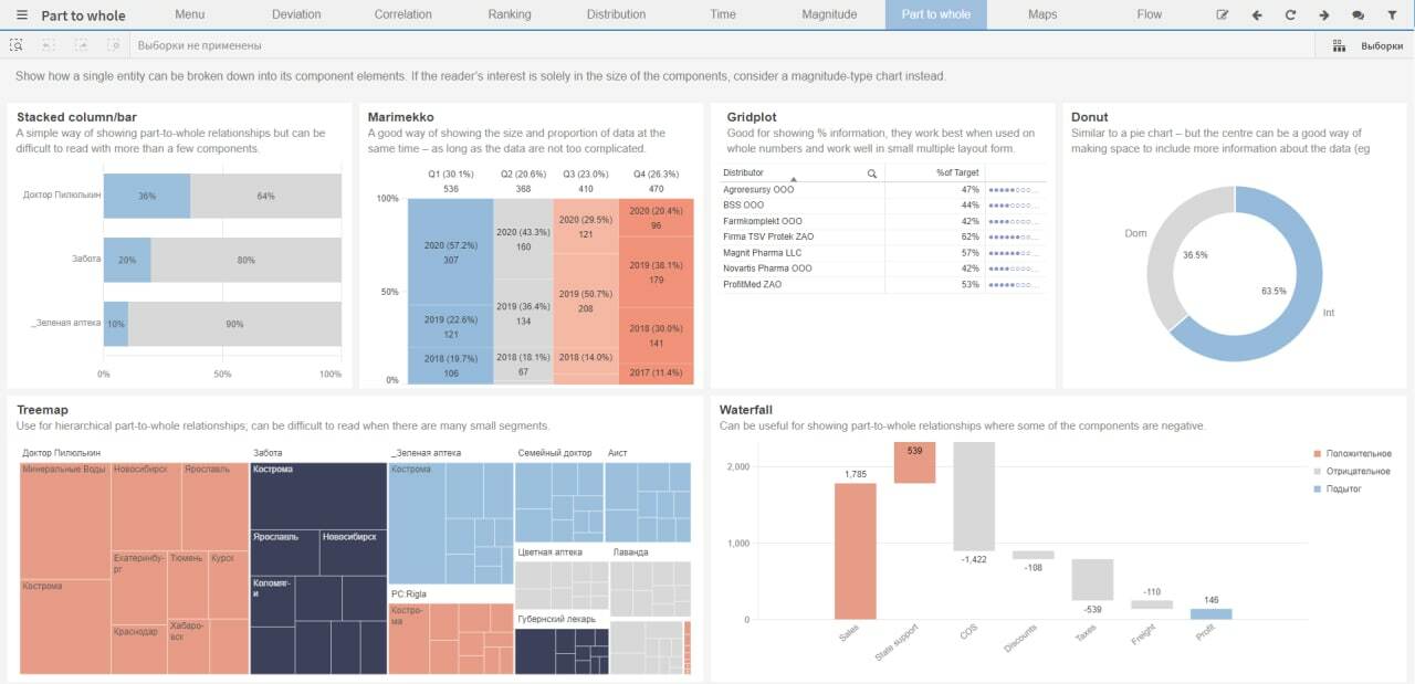
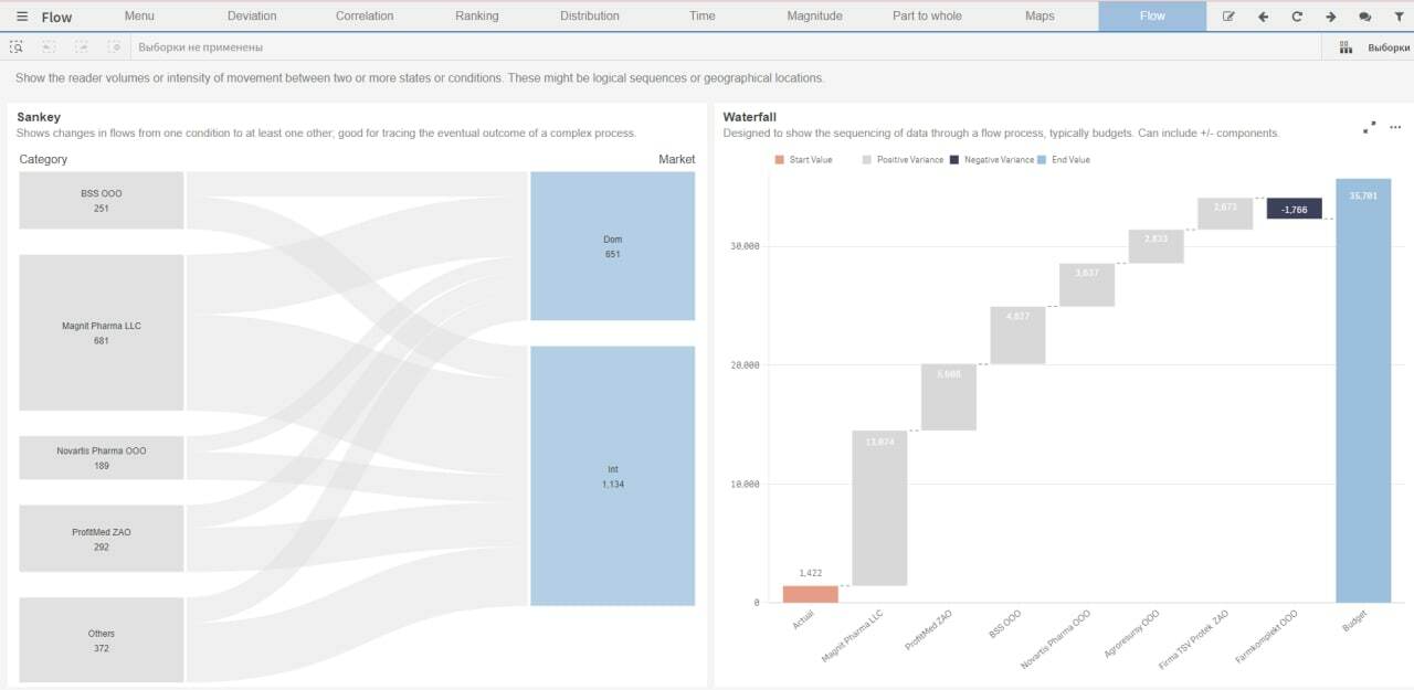
Once we had designed the various elements of the report, we needed to create guidelines for their use. We created a style guide that outlined the standard visual design and report development requirements for bi analysts within the company. The guide included instructions for the use of the QlikSense theme, the report template, and the visual vocabulary we had developed. We also provided guidelines for the use of colors, fonts, and chart types.
Step 6
With the style guide in place, we were able to train the bi analysts within the company on how to use the new report design. We held workshops and provided one-on-one training to ensure that everyone was comfortable with the new design elements and understood the requirements for report development.
Conclusion
Creating a corporate style guide for QlikSense was a challenging but rewarding project. By creating a standardized view of the report and developing a visual vocabulary, we were able to ensure consistency in the company’s BI projects. The QlikSense theme proved to be a powerful tool for customizing the look and feel of the reports, and the report template provided a time-saving solution for report development. With the style guide and training, we were able to empower bi analysts within the company to create beautiful and functional reports that met the company’s needs.