DataGraph
DataGraph is an extension that allows you to analyze information in the form of a graph.
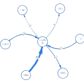
Graphs are mathematical structures used to study pairwise relationships between objects. They comprise two parts: nodes that contain data and arcs that connect nodes to each other. A node can be connected to any other node, and representing data in the form of graphs helps us visualize ideas and make better decisions based on graphically interpretable data.
The benefits of analyzing data using graphs include their human-friendliness, the ability to handle interconnected data, and the ease of identifying anomalies, especially in cases of fraud. Graphs are applied in data analysis for banking transactions, logistics, telecom, and marketing.

Our Qlik Sense extension, DataGraph, allows clients to customize the hypercube to the specifics of a particular implementation
This involves adjusting the graph parameters and calculated metrics. We can adjust ready implementations to a new customer’s data structure or adjust the new customer’s data structure to the existing implementations.

Examples of Implementation
Industries
Our Graph extension has been used in various projects, including analyzing transactions and connections of legal entities for a bank. The graph diagram displays the links between counterparties, with green nodes representing the counterparties in question, white nodes indicating the bank’s clients, and gray nodes representing non-clients. Debit and credit transactions are represented by green and red connections, respectively. Visualization of the column node contains the client’s name and TIN, while visualization of the column connection contains the sum of the transaction.
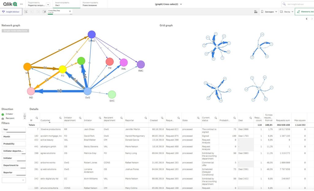
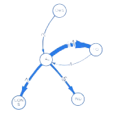
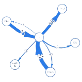
In a real estate sales analytics project, our Graph extension shows cross-sales links between internal departments of the company. A node represents a company department, while the connection is cross-applications. The number of requests and their total amount can be used as an indicator to connect the nodes. Each department’s graph has a unique color.
In another bank project, we utilized the Graph extension to analyze detailed information about the allocation of IT costs to customers. The graph displays relationships between IT cost allocations, with orange nodes representing cost causes, green nodes representing cost groups, and blue nodes representing cost objects. Each visualization of the graph node contains the name of the corresponding object, while the visualization of the graph links contains the exact amount of costs.
Finally, our Graph extension was also used in a bank project that analyzed customer payments. The graph diagram displays links between counterparties, with blue nodes representing counterparties in question, yellow nodes representing the sender or receiver of the payment, and orange nodes representing debit transactions. The visualization of the graph node contains the client’s name, while the visualization of the graph connection contains the transaction amount.
Technologies
JavaScript Toolkit for Advanced Graph Displays:
DataGraph offers a premier JavaScript library tailored for creating impactful, large-scale interactive graph visualizations. It’s your one-stop solution for efficient graph data visualization and analysis, designed to boost your overall productivity.
Visualize Over a Thousand Nodes in Moments:
Empowered by Vis.JS rendering, modular design, and cutting-edge layout algorithms, DataGraph ensures that large graph displays aren’t just feasible but also dynamic. With DataGraph, effortlessly view and engage with thousands of nodes and edges in seconds. Plus, benefit from intuitive layouts that reveal your graph data’s intricacies at a glance.
Unlock Actionable Insights from Your Graph Data:
Craft enriched visual experiences that demystify intricate business networks for every user. Highlight groups visually, embed annotations, or seamlessly shift between data representations. Harness our profound graph know-how to develop a user-friendly app that’s not only practical but also beloved by users.
Refine and Focus Your Data Visualization:
Effortlessly adjust your data through filters, groupings, or transformations, ensuring you visualize only the most pertinent information.
Demystifying Graph Visualization:
Our comprehensive guides and templates on data import and DataGraph integration with popular JS frameworks enable you to set up a functional app in just 15 minutes. With over 50 pre-designed examples, customizing your app—from node coloring to layout optimization—has never been easier. Streamline development and concentrate on delivering value.
User guides and manuals
Overview and user guide for the Graph extension
Product Pricing
Free
The library has 3 versions of the graph, many settings, limit of 200 edges in the graph.
Enjoy these features for free:
Standard
Upgrade to our premium package to enjoy all the benefits of the free options, complemented by limitless visualization capabilities in the library.
Free features plus:
Tailored Library Versions for Leading BI Systems
Each version is honed to ensure maximum compatibility, advanced feature sets, and a seamless user experience. With these integrations, data visualization across diverse BI platforms has never been more powerful and streamlined.
Questions? Need more than one license? Call us at
+1-754-270-3097, start a chat, or email us at grom@businessqlik.com