- DataGraph: general information
- Installing of the DataGraph extension
- Properties of the DataGraph extension
- Examples
1. DataGraph: general information
DataGraph is an extension that allows to analyze the data in terms of the interactions among the elements represented as graphs.
These are mathematical structures used to formalize and represent the pairwise relationships among the objects. They consist of two basic elements:
- Nodes (vertices) – represent specific objects;
- Arcs (edges) – represent relationships between objects.
A node can be connected to any other node certain number of times, as well as have different directions of links. The representation of the data in a form of graphs allows you to visualize the relationships between the objects, to identify patterns or anomalies of these relationships; the results of the analysis, in turn help to make more informed management decisions.
With the help of the DataGraph extension all the data can be represented in one of three types of graphs, which allow you to analyze objects and the relationships among them from different points of view and help to identify different features of these relationships.
1.1. Network
In the Network graph all the objects are a part of the same graph and the connections among the objects are shown as directed arcs:
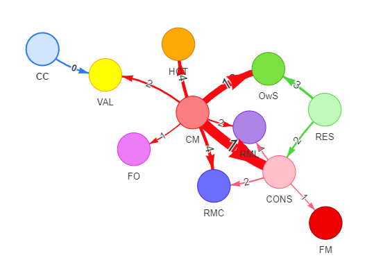
The Network graph allows you to see the connections among all the elements globally and does not allow the display of duplicate nodes.
1.2. Grid
In a Grid graph each object is displayed as a separate element and it is the central node of the graph; around the central nodes there are nodes that have only one step-length links with the central nodes:
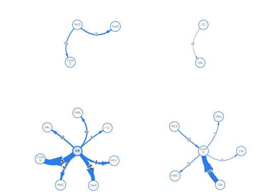
In this type nodes can appear several times: as centre nodes and as nodes connected to other centre nodes.
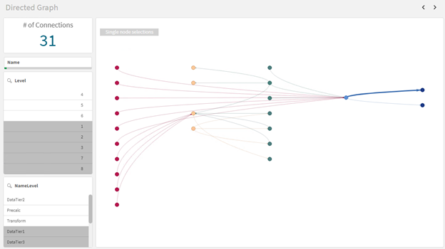
1.3. Directed
In a Directed graph nodes have a hierarchical structure and are located at certain levels, the arcs represent the presence of links among these objects (Fig. 3). There are no restrictions on the types of links among the objects of different levels: arcs can connect nodes of neighboring levels sequentially – from the top to the bottom – and vice versa, can be observed among the elements of non-neighboring levels, they also can display the presence of the links among the elements of the same level.
This type of a graph is particularly convenient for analyzing cases when the elements (nodes) have a certain hierarchy and the links among them are mainly top-down (from the top level to the bottom).
1.4. Choice of the single nodes/ chains of the nodes in DataGraph
The DataGraph extension is interactive and allows the user to select the desired items to be displayed directly in the graph visualization area. The extension provides two modes of selecting items for display:
1. Single node selections – the graph displays only one user-selected node and its associated nodes within one step (a single click selects a new centre node each time).
2. Node chain selections – the graph displays all the nodes selected by the user and their associated nodes within one step (a single click adds another node to the previously selected centre node).
You can change the node selection mode in the upper left corner of the visualization object. Changing the node selection mode is available only in Network and Directed graphs. In Grid graphs single node selection is applied by default: by clicking on an element you will select it, this element is displayed as the centre node.
NB! when you change the selection objects (inside or outside the DataGraph extension), you are “flipped” to the single selected node.
For example:
1. A user selects Company1 and Company2 in the list of companies (outside the DataGraph extension).
2. The user sees Company1, Company2 and their direct relationships displayed;
3. User sets the node chain selection mode.
4. The user clicks on Company3 directly in the DataGraph extension (which is linked to one of the already displayed nodes).
5. The user will only see one displayed Company3, because the user has changed where the selection is performed.
This also works in the reverse order:
If a User sets the node chain selection mode and selects Company1 and Company2 directly in the DataGraph visualisation extension, he will see two of them and their associated items at that point.
If a User selects Company3 in some other visualization object, he will see Company3 only.
2. Installing of the DataGraph extension
In order to create a graph visualization in your Qlik Sense application you need to install the DataGraph extension. Prior to the installation make sure that the following requirements are met:
- You have the downloaded DataGraph extension in ZIP file format.
- You have one of the Qlik Sense options installed: Desktop (on a workstation), Enterprise (server environment deployed), Saas (cloud environment deployed).
- In the case of Enterprise and Saas: you have an account with access to perform administrative functions in Extensions in the Qlik Sense Management Console (QMC/MC).
- If you have already installed previous versions of the DataGraph extension they must be uninstalled.
2.1. Installation to the Qlik Sense Desktop
1 Open the Documents folder on your computer where Qlik Sense Desktop is installed, then navigate to the Qlik folder and to the Sense folder.
Alternatively you can open the required folder by using the folder path below and replacing the <username> part with your account name:
C:\Users\<username>\Documents\Qlik\Sense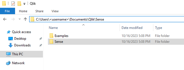
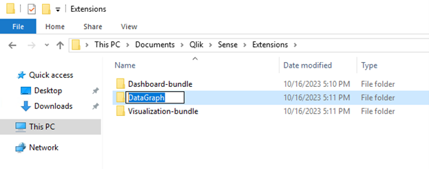
2 In this catalogue there is Extensions folder – it should contain all the extensions you want to use in Qlik Sense. Open this folder.
3 Create a separate catalogue in the Extensions folder and name it DataGraph.
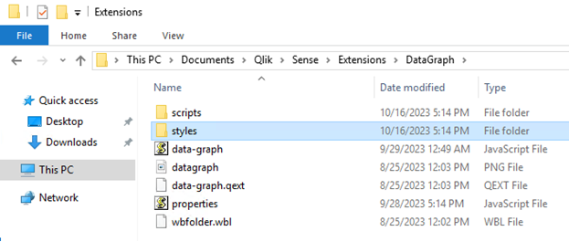
4 Extract the contents of the ZIP file with the extension into the created folder.
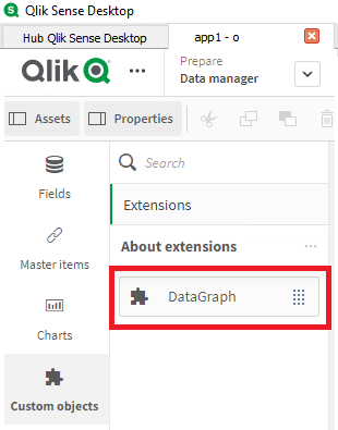
5 Open Qlik Sense Desktop and launch any application. Switch to sheet modification mode.
6 In the resource menu on the left, under Custom Objects, the DataGraph extension will be available for the usage.
2.2. Installation to the Qlik Sense Server
1 Open the Qlik Sense Management Console (QMC)
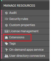
2 Go the Extensions.
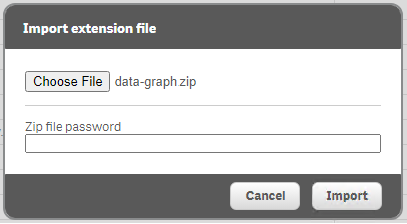
3 At the bottom of the page click Import and import the ZIP file with the extension into the Qlik Sense environment.
You do not need to extract the contents of the archive.
4 As soon as you see the message that the extension has been successfully imported go to Qlik Sense Hub and open any application. Go to the sheet modification mode.
5 In the resource menu on the left, under Custom Objects, you will see the DataGraph extension that will be available for the usage.
3. Properties of the DataGraph extension
3.1. Measurements
With the help of the measurements it is possible to describe and display graph nodes on the visualization. While setting up the graph it is important to keep the order of the added measurements as each measurement is responsible for a specific parameter of the node:
| N | Measurement | Network | Grid | Directed | Description | Comments |
| 1 | id | + | + | + | ID of the selected (central) node element | There should be an integer |
| 2 | label | + | + | + | Tag of the selected (central) node | |
| 3 | idRight | + | + | + | ID of the element connected with the central node | There should be an integer |
| 4 | labelRight | + | + | + | Tag of the element connected with the central node | |
| 5 | level | + | Value for determining the level of the central (selected) node | There should be an integer | ||
| 6 | levelRight | + | Value for determining the level of the element connected with the central node | There should be an integer |
3.2. Measures
With the help of the measures it is possible to adjust the characteristics of arcs and nodes of the graph. While setting up the measures, as well as while setting up the measurements, it is extremely important to take into account the order of the measures as each position of the measure is responsible for a certain property
| N | Measures | Obligatory | Description | Comments |
| 1 | calcBasis | + | The numerical equivalent of the link between nodes. | It can determine the number of the transactions, number of the postings among the nodes etc. |
| 2 | color | + | Value used in order to select the color of the selected (central) node. | There should be a code or a function of the color determination. |
| 3 | colorRight | + | Value used in order to determine a color of the node connected with the central node. | There should be a code or a function of the color determination. |
| 4 | image | – | Link to the image used as a central node view | It is necessary to set the Node shape – «image» or «circularImage” parameter |
| 5 | imageRight | – | Link to the image used as a central node view | It is necessary to set the Node shape – «image» or «circularImage” parameter |
3.3. Sorting
Not applicable
3.4. Additional information
In the Data Processing section of the DataGraph extension, as in other Qlik Sense visualisation objects, you can configure a condition for displaying a chart and specify a message to be displayed if a certain condition is not respected.
3.5. View
3.5.1. General
The General section provides the ability to customise diagram headings and subheadings, add a footnote and enable the display of an action menu while hovering over the diagram or information about its contents.
3.5.2. Other states
This section is used to configure the states for the DataGraph extension. The principle of operation of the graph extension with alternative, inherited and default is standard: the extension works with states in the same way as basic objects of Qlik Sense visualizations.
3.5.3. Data settings
The Data Settings section allows you to set three graph parameters:
| Parameter | Value by default | Description |
| Field name for selections | «Node name field» | While setting this parameter you should specify the field whicg values will be selected while clicking on the graph nodes. |
| Graph mode | «Network» | In this block you should select one of the available graph types. |
| Rows request size | 1 | These settings define the “size” of the pulled data. |
3.5.4. Appearance settings (additional)
With the help of the parameters in this section it is possible to customize the appearance of the graph
| Parameter | Value by default | Description |
| Display shadow | Off | The parameter allows you to enable/disable displaying the shadow of graph elements |
| Background color | #FFFFFF | In this block it is necessary to select the background colour of the graph object |
| Elements in row | 4 | Allows you to select the number of elements in a row (Grid graph only). |
3.5.5. Nodes settings
The node settings section allows you to set the necessary parameters for the graph elements
| Parameter | Value by default | Description |
| Node shape | dot | It allows you to set the shape or view for displaying nodes (e.g. circle, rhombus, image) |
| Node size | 25 | In this block you can size the displayed nodes |
| Node font size | 14 | It allows you to set the font size of node captions |
3.5.6. Lines settings (main)
This section provides the possibility to set the basic settings of the graph lines (arcs).
| Parameter | Value by default | Description |
| Line value display | Off | The parameter allows you to enable/disable the display of measure labels as arc signatures |
| Line font size | 14 | In this block it is necessary to set the font size of labels |
| Use line value on build | On | It allows you to set the effect of the measure value on the width of the graph arc: if the measure affects the width, the larger the measure value, the larger the width of the graph arc. |
3.5.7. Lines settings (additional)
This section contains additional settings for the graph lines (arcs).
| Parameter | Value by default | Description |
| Line curvative | dynamic | It allows you to adjust the curvature of the arcs connecting the nodes |
| Line value position | top | Defines the position of the arc tag |
| Line size scaling | 0.6 | Determine the size of the character that indicates the direction of communication |
| Line lenght | 70 | It allows you to determine the arc length |
| Arrowhead type | arrow | It allows you to select the type of a symbol that indicates the direction of communication (e.g. arrow, circle, etc.) |
| Arrowhead image source | undefined | It allows you to specify the source (link) to an image for a symbol indicating the direction of the link (only for the symbol type image) |
3.5.8. Directed graph settings
This section contains settings applied to the graph type Directed only.
| Parameter | Value by default | Description |
| Graph direction | Up – Down | It allows you to select the graph direction (left-to-right, top-to-bottom, etc.) |
| Levels distance | 150 | It allows you to set the distance among the levels |
| Nodes distance | 100 | It sets the distance among the nodes (within a level) |
| Nodes trees distance | 200 | It allows you to set the distance between each individual node tree |
4. Examples
The DataGraph extension allows you to explore the elements and the relationships between them, and the different types of graph allow you to emphasize different characteristics of these relationships in your analyses.
In this section we will look at the examples of how each of the graph types can be used, how the data should be prepared for graphing and what settings should be made in each case.
4.1. Description of the initial data
Any data that describes the existence of relationships between two objects can be used to construct a graph. The structure of the data tables must contain all the fields necessary to establish the dimensions and measures of the graph.
In order to demonstrate the construction of all three types of graph we will use the information about the movement of data flows within the framework of a BI solution project. The source is a table that describes the paths of the data movement among different nodes, which are different data processing applications or physical data files. The data is loaded from the source table and placed into the GraphData table. A description of the composition of the data table is given below.
| Name of the field | Description | Graph attribute |
| %Id | Contains a unique identifier for the flow – movement from one node to another. | Used in Count(distinct %Id) |
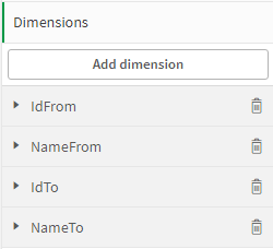
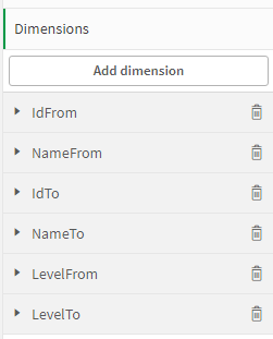
| IdFrom | Contains the unique identifier of the node that is the parent node in the stream (stream source). | id |
| NameFrom | Contains the name of the node that is the parent node in the stream (stream source). | label |
| LevelFrom | Contains the level sequence number of the node that is the parent node in the stream (stream source). | level |
| ColorFrom | Contains an expression defining the colour of the HEX node that is the parent node in the stream (stream source). Each level has its own defined colour. | color |
| IdTo | Contains the unique identifier of the node that is a child of the stream (stream receiver). | idRight |
| NameTo | Contains the name of the node that is a child of the stream (stream receiver). | labelRight |
| LevelTo | Contains the level sequence number of the node that is a child of the stream (stream receiver). | levelRight |
| ColorTo | Contains a HEX node colour definition expression for the colour of a node child in the stream (stream receiver). Each level has its own defined colour. | colorRight |
| NameLevelFrom | Contains the name of the node level that is the parent node in the stream (stream source). | Not applicable in the graph |
| NameLevelTo | Contains the level name of the node that is a child of the stream (stream receiver). | Not applicable in the graph |
Once the data from the main data table, which we will use to configure the graph, has been loaded into the application, it is necessary to create a table of nodes – GraphNodes – based on this data. The GraphNodes table must contain the information about all the nodes that are mentioned at least once in the source data table as parent and/or child elements. At the same time, each node in this table must be associated with the source record describing the data flow.
Description of the GraphNodes table field composition:
| Field of the GraphNodes table | Initial field | Desciption |
| %Id | %Id | Contains a unique identifier of the flow – movement from one node to another. It is the key between two tables. |
| Id | IdFrom | Contains node identifiers |
| IdTo | ||
| Name | NameFrom | Contains the names of the nodes. Used as the field to which the selection is applied in the column |
| NameTo | ||
| Level | LevelFrom | Contains the sequence numbers of the node levels |
| LevelTo | ||
| Color | ColorFrom | Contains colour expressions for nodes |
| ColorTo | ||
| NameLevel | NameLevelFrom | Contains the names of the levels |
| NameLevelTo |
Additional information:
If the field composition of the source data table is exactly the same as the field composition of the GraphData table described above, you can use the script below to generate the GraphNodes table.
GraphNodes:
load distinct
    %Id
    ,pick(iterno(), IdFrom, IdTo) as Id
    ,pick(iterno(), NameFrom, NameTo) as Name
    ,pick(iterno(), LevelFrom, LevelTo) as Level
    ,pick(iterno(), ColorFrom, ColorTo) as Color
    ,pick(iterno(), NameLevelFrom, NameLevelTo) as NameLevel
Resident
    GraphData
While IterNo() <= 2
;
4.2. Setting of the graph
4.2.1. Network
Once the data has been loaded into the application successfully, the graph must be customized.
In order to do this select the DataGraph extension from the Custom Objects menu on the left and add it to the application sheet. Then you should configure the nodes and arcs of the graph: set the fields of the GraphData table to the appropriate graph dimensions and configure the graph measures.
After that it is necessary to configure the graph appearance parameters:
- In the General section, if necessary, specify the title/subtitle of the graph.
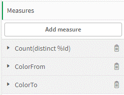
- In the Data settings section specify the [Name] field as the field used for sampling; select the graph type Network.
- In the Nodes settings section set the node symbol value to “dot”; set the node size to 25 and the font size of node captions to 14.
- In the Lines settings (main) section, disable the display of measure values on arcs; disable the use of measure values for drawing arcs.
The Sorting and Additions section remain unchanged.
We also add a KPI object to the sheet that displays the total number of the links (the measure used in the graph) and three filters by node name, node level number and node level name. The result is a dashboard that allows us to see all the available flows among all the available nodes. The filters on the left side allow you to set selections and limit the number of nodes displayed in the graph.
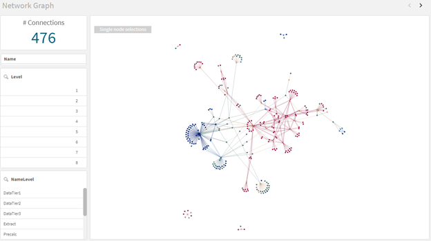
The graph does not show the real number of the flows leading from one node to another; the number of these flows does not affect the arc width – the graph shows only the presence of a flow.
In order to analyze the number of the flows among the nodes we will create a graph of Grid type.
4.2.2. Grid
A grid graph allows you to display multiple nodes as individual centre elements and to show the presence of the links of this element to others. Since a Grid graph will display as many individual graphs as there are unique nodes selected (available), the maximum number of the nodes to display should be limited so that the graph is readable.
The Grid graph will have the same basic node settings as the Network graph, so in order to create it we will copy the previously configured Network graph and place it on a new sheet.
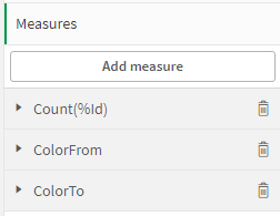
The measurements of the graph should be left unchanged but in the Measures section we need to change the formula for calculating the measure: in order to display not just the presence of the flow, but also the actual number of the flows from element to element, we need to count the total number of the links among the nodes, so we will use the formula for counting all the links rather than unique links.
In order to visualize the differences in the number of the threads we need to enable the option to use the measure values to influence the width of arcs in the Lines settings section of the View block.
In the Additions section we will set a condition for graph calculation: the graph should be calculated only if the number of available nodes is less than or equal to 30. If the condition is not fulfilled, we will indicate an error message.
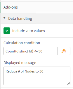
In order to enable a user to see the current number of the nodes, set the appropriate expression in the graph subheading in the View section.
='current nodes value: ' & Count(distinct Id)Having selected a certain number of the nodes we will see a Grid graph displaying these nodes and their associated elements.
After that we will configure a third graph type, Directed, in order to show data flows among the nodes distributed across the tiers.
4.2.3. Directed
While developing a BI solution project, the process of data transformation has a conventionally defined direction: from the initial sources, data are sent to transformation applications, then stored in intermediate files, and then sent to the applications of the next stages, which perform the final transformations and calculations of the necessary indicators. Therefore, we can say that the data nodes have a certain hierarchy and, accordingly, can be categorized into levels. The information about the node belonging to a certain level is contained in the initial fields LevelFrom and LevelTo, they will be used in order to configure the Directed graph.
As with the Grid graph we will use the previously configured Network graph as the basis for creating a new graph, for this purpose we will copy it and place it on a new sheet.
This time we will need to make a change to the Measurements section, namely to add the fields that define the levels of outgoing and incoming nodes.
Leave the Measures section and the previously configured sections of the View block unchanged, and make the following settings in the Directed graph settings section:
- Graph direction – from left to right.
- Distance between levels – 1000.
- Distance between level nodes – 200.
- Distance between separate trees – 300.
As a result we will get a graph describing the flow movements between the elements distributed on different levels: